Goodmorning Copic fans, today we are looking at Copic Various Inks. Various Ink refills are part of what make the Copic system truly amazing. All 358 marker colors have a matching bottle of ink. Each bottle will fill a dry marker up to 15 times, depending on the style of marker. Each bottle of ink has a built in dropper tip for simple application. The airtight inner seal prevents the alcohol ink from drying out for many years. Now while it's true their intended purpose is to refill your markers (
Kathy discussed this in the last post), they are an amazing art supply all by themselves, incredibly versatile and perfect for creating alcohol ink based art projects. Today we are looking at using Copic Various inks in 2 different ways, allowing you to incorporate more inky fun into your cards, pages, canvas or scrapbooking layouts.

Materials
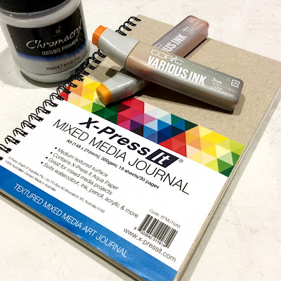
- Copic Various Inks: V15, BV04, RV19, V06, R35, RV32, Y38, YR04 & YG01
- Copic Colorless Blender
- Copic Multi Liner in 0.3 & 0.5
- X-Press It Mixed Media Journal
- Kirarina Wink Pens - Precious Set
- Chromacryl Gesso
- Paint Palette, brush & mister
Instructions
Step 1
Begin by preparing a page in your X-Press It Mixed Media Journal with gesso. If you would like a white background paint the page with white gesso, if you would like a coloured background, then add a few drops of Various Ink to your gesso to create a tint. Wait for the gesso to dry before moving to step 2. Painting the page with gesso seals the paper and will allow the Various ink to move around more. This example uses YG01 and Y38 to tint the gesso.
Step 2
Add one drop of Various Ink onto your background, because the paper has been sealed, the ink will spread and wick forming a circular shape. This example uses R35 as the first colour. For larger circles add a second or even a third drop of ink. One drop goes quite a long way.
Step 3
To create some variation add a single drop of Various Ink - Colorless Blender to the center of each circle. This will create a paler area in the middle.
Step 4
To create a more interesting looking circle add a single drop of a different colour to the center. This example uses Y38. You may notice that a single drop of any colour travels almost the same distance over the gesso!
Step 5
To create smaller circles, add 3 drops of colour and 2 drops of Colorless blender to a plastic surface, mix together and apply using an old paint brush. Adding a smaller amount of liquid/ink results in a smaller circle! You can use the brush to create smaller flowers, flower centers or add little drops of colour to the background.
Repeat Steps 2-5 using a variety of Copic Various Ink colours, until you have almost covered your background. This example uses: V15, BV04, RV19, V06, R35, RV32, Y38 & YR04
Step 6
Add a little Various Ink - Colorless Blender to a small mister and lightly spray the Colorless Blender from a distance of about 15cm over your circles - this will create random spots and create pattern and interest.
Step 7
Use black Copic Multi Liners 0.3 & 0.5 to add a doodled designs and embellish your circles. I made my circles look like flowers by adding lines to resemble petals.
Step 8
Use Kirarina Wink pens from the Precious Metals set to add touches of pearl and metal to your design - once dry you can draw over the ink with your Copic Multi Liners for extra detail. I love how these look over the Copic Various Inks - it really brings the page to life.
This is some of the ink pattern and doodling up close - the Various Inks give the most amazing concentrated colour to your projects.
and the finished project looks like this, a little wild and chaotic, but so much fun to create.
So grab your Various Inks and use them on your next project - they're not just great for refilling your markers, but are fabulous all on their own.
Back with more next month,
KatePin It


